Keep the geometry intact
Do not redraw, stretch, rotate, outline, or rearrange the mark.
AZZLE / Brand system / 01
AZZLE is the coordination layer for work that has to become real. The identity is precise, open, and built to hold up in motion.
Explore the system ↓01 / Mark
The AZZLE mark combines a directional form with a network of endpoints. It should feel engineered, active, and unmistakable at a glance.
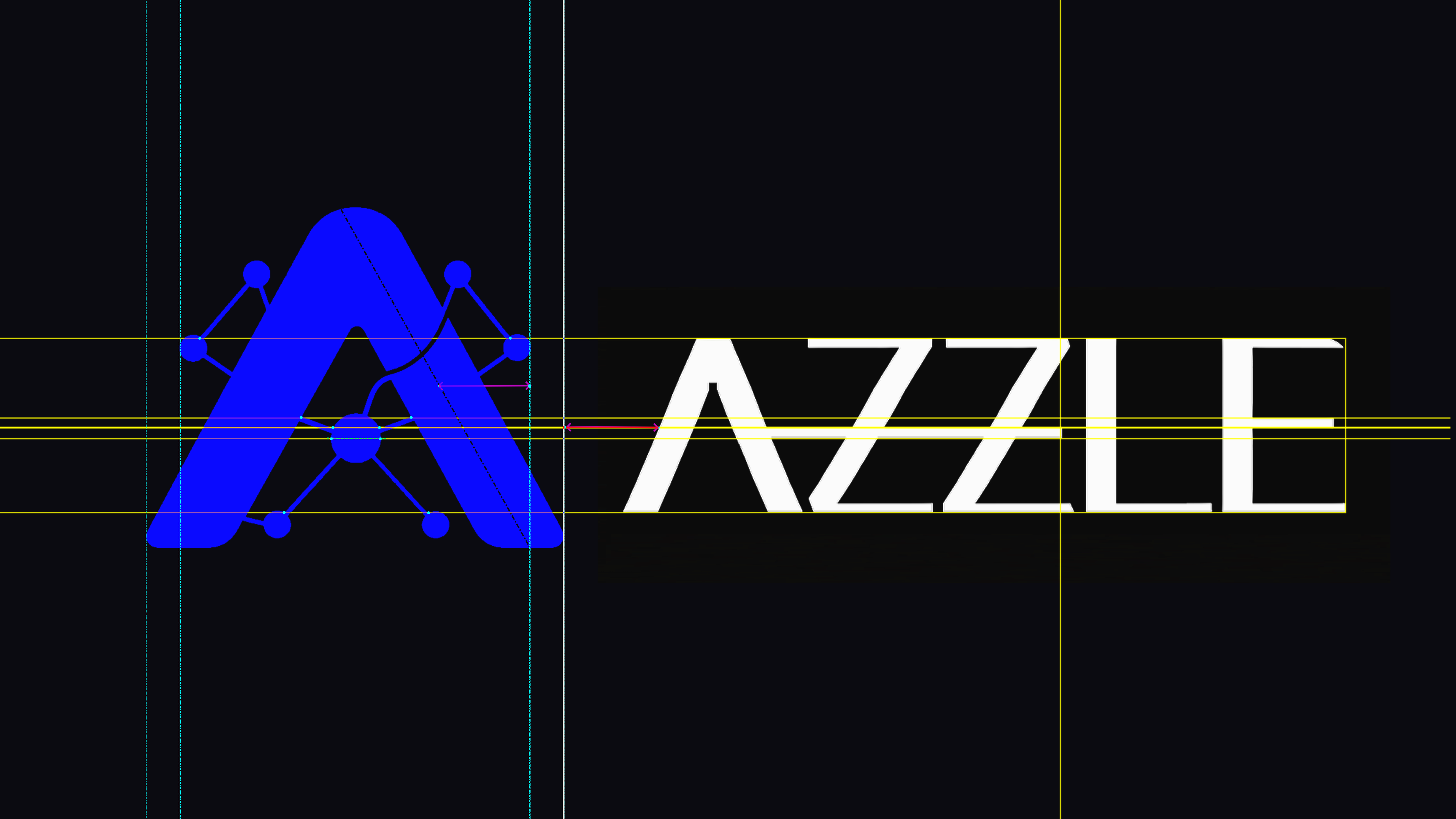
Do not redraw, stretch, rotate, outline, or rearrange the mark.
Protect the logo with clear space at least equal to the height of the small endpoint squares.
Prefer the full AZZLE lockup for introductions. Use the symbol alone only when the context is already established.
02 / Color
The palette is a dark working surface with a single electric accent. Color should clarify action, state, and hierarchy / not decorate the interface.
#0A0A0FPrimary surface#F4F4F5Primary type#C8F169Action + focus#0000FFProtocol + data#167C3ANetwork context03 / Type
Typography moves between editorial confidence and machine-readable precision.
Buy results.
Not prompts.
task.status → complete
escrow.release → true
network → base:8453
04 / Usage
Use strong alignment, generous space, concise language, and the signal color for moments that need a response.
Do not add gradients to the mark, place it on noisy imagery, or use the accent as a general background.